

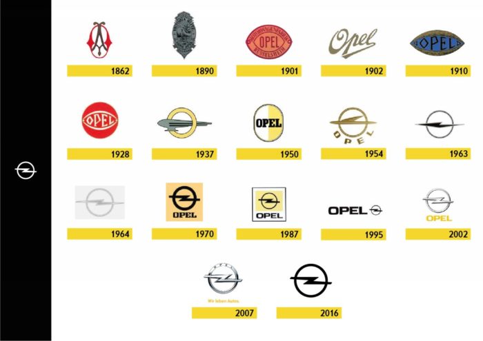
Although the most recent news is that they have updated your logo, the truth is that there is a lot behind a brand like Opel. Founded on January 21, 1862 in the German town of Rüsselheim by adam opel, the first product of the current lightning firm was a sewing machine. A year later, he made his first elevated wheel bikes, known as penny farthings. Bicycle production soon surpassed sewing machines, leading both markets by the time Adam passed away in 1895.
The first cars would arrive in 1899 after Adam’s wife Sophie and their two eldest children teamed up with Friedrich Lutzman, a locksmith who had been working on automobile designs for some time. Their first products were not very successful and two years later the collaboration was dissolved. In 1901, the company signed an agreement with Darraq to manufacture their vehicles under license.
He first car of its own design, it would be shown for the first time in 1902 at the Hamburg Motor Show. It would reach production in 1906 and the production of the Opel-Darraq would be suspended in 1907. In 1909 the sale of the Opel 4/8 HP (four cylinders and eight horses), also known as Opel “Doktorwagen”. It enjoyed notable success, as it cost half the cost of other contemporary models and its reliability and robustness was demonstrated. The rest of the models are already history.
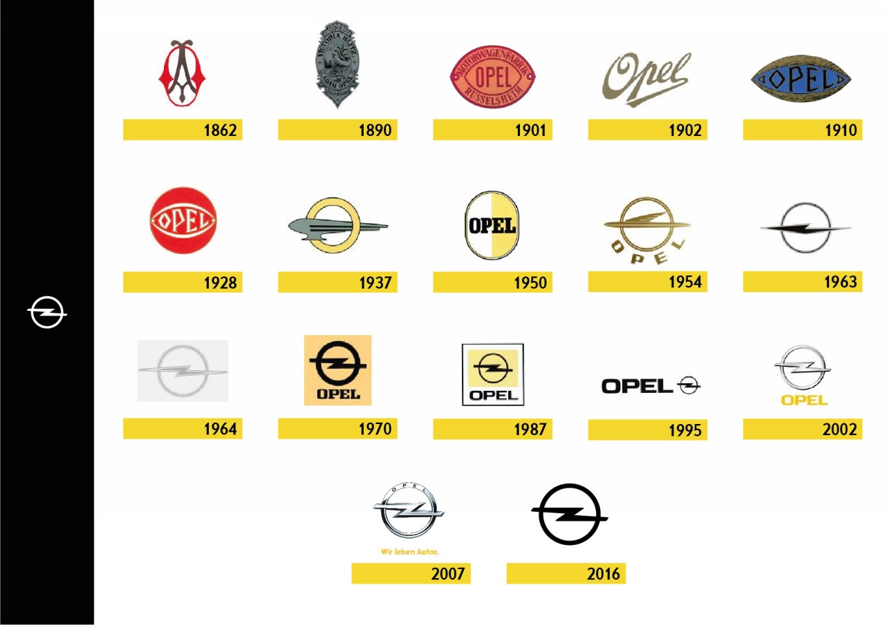
But the brand’s identity was still not defined by the lightning bolt crossing the circumference as we know it today. When the company was founded, its sewing machines proudly bore the neoclassical-inspired initials of its founder. Once immersed in the manufacture of bicycles at the end of the 19th century, the model “Victoria Blitz” gave rise to an elaborate image starring the goddess Victoria, protecting a cyclist with her flight.
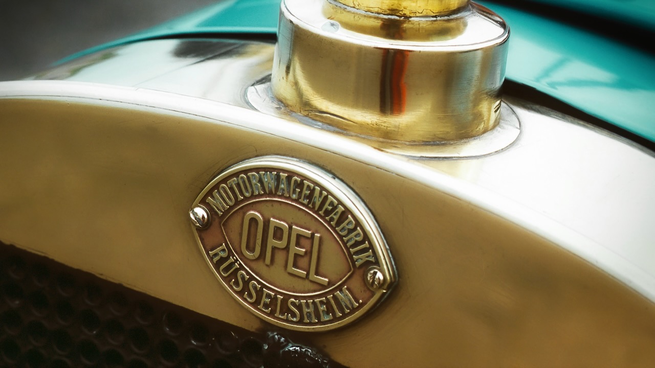
Taking advantage of the presentation of his first car, the Opel 10/12 HP Tonneau a new emblem in the shape of an eye began to appear on its radiator, which contained the Opel surname, wrapped by the legend “Rüsselsheim car plant”. At the same time, the company’s motorcycles sported a stylized logo with the Opel surname which, from 1909 and with some variations, was also adopted by its four-wheeled vehicles, such as the Docktorwagen.
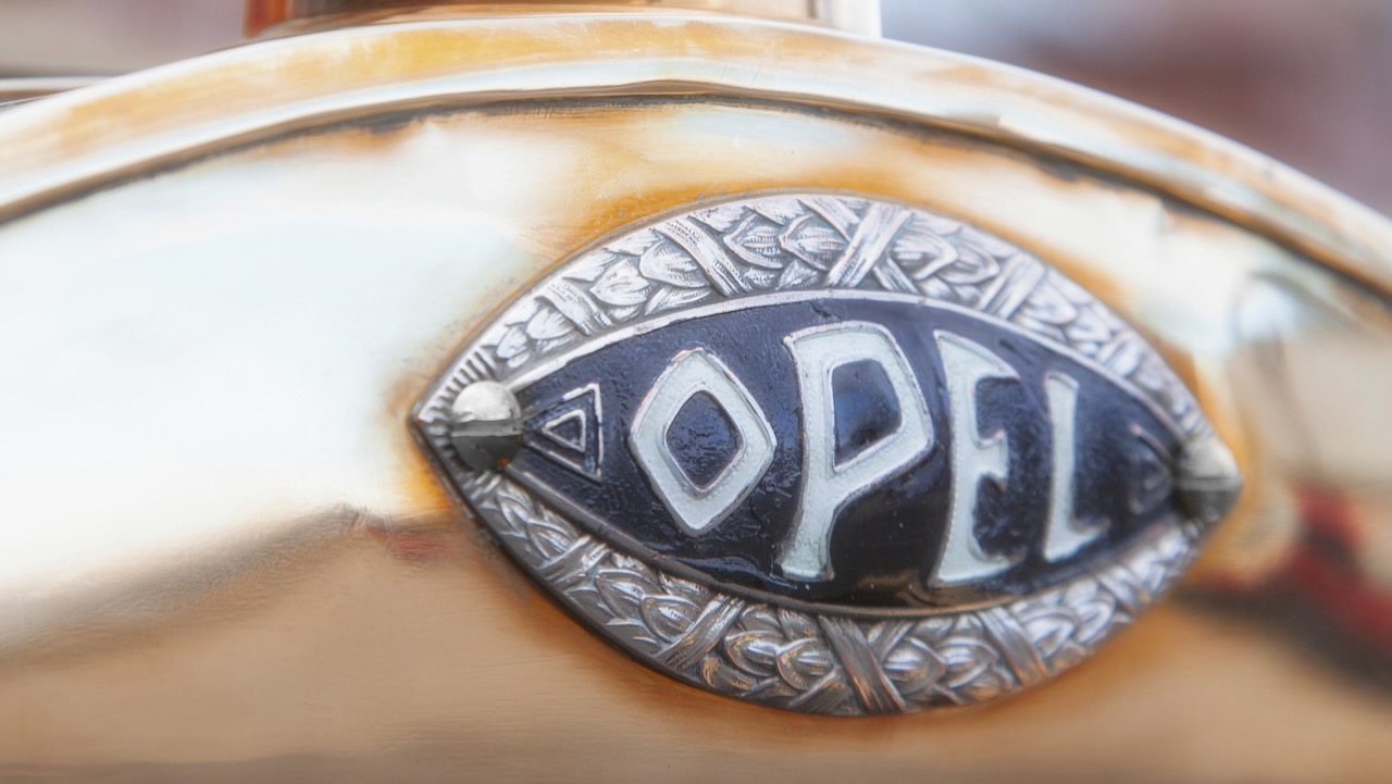
Starting in 1910, wilhelm vonopel (Adam’s eldest son and owner of the same with his four brothers and his mother) opted for an isologo that represented both the brand and the company. He regained the shape of the eye, though this time surrounded by bay leaves. This design remained the Opel brand identification until 1935 with hardly any modifications. The author of this emblem was Ernst Ludwig of Hesse-Darmstadt, Grand Duke of Hesse.
In 1928, when the company resumed motorcycle production, the eye adapted to its new support, acquiring a golden color and framed in a red circle that managed to clearly differentiate two-wheelers from Rüsselsheim automobiles. Starting in 1937, the company acquired as a sign of identity a stylized Zeppelinwhich in those days represented human innovation and technical progress.
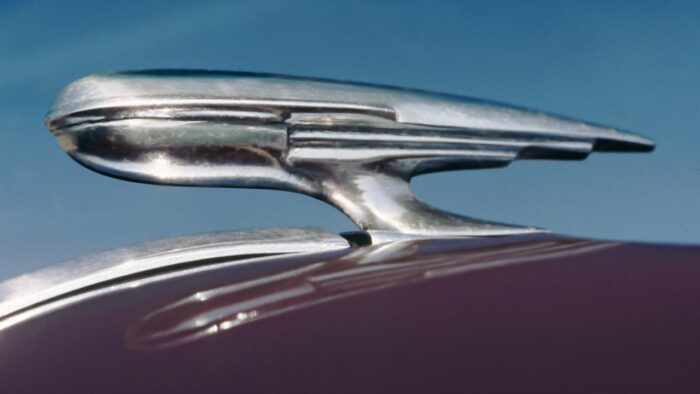
In 1952, the color white and yellow they appeared for the first time in a house logo as the official insignia of the brand and its dealers. An oval-shaped logo that had been developed at the same time as the zeppelin isotype in 1937. Two years later, the outdated zeppelin was replaced in early postwar models by a futuristic aircraft reminiscent of a rocket. .
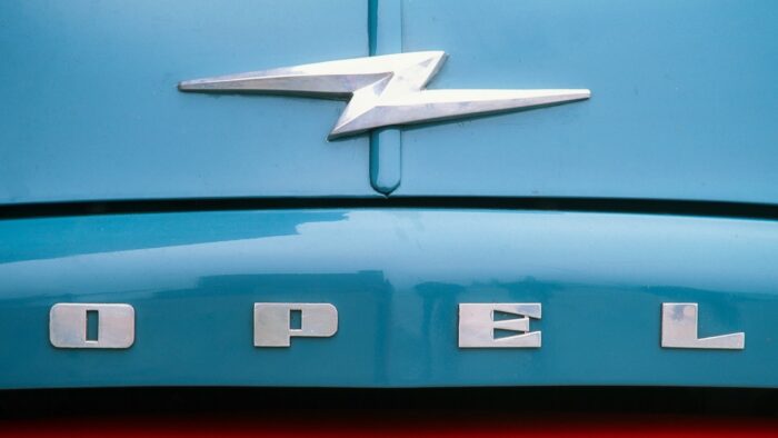
Its gradual modifications over the years gave rise to a shape that already in 1963 looked more like lightning than an airship. This is how the famous was born blitz(lightning in German) that Opel bicycles and trucks had previously worn and that would continue to evolve to this day. The lightning bolt became the official emblem of the brand a year later, always surrounded by a circle that would subtly evolve during the 60s and 70s.
In 1970, the first opel typography under the logo, framed in a yellow square. In 1987 it was remodeled, reducing the yellow field to achieve greater visual appeal. In 1995, the striking new corporate logo tried to emphasize the growth of the company, more modern and on a global scale. Although the Opel surname was emphasized, the cars only sported the lightning bolt and ring on the hood and trunk lid.

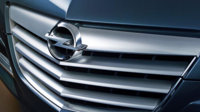
In 2002, the lightning bolt turned into a three-dimensional figure with oblique corners and a dynamic silhouette. The one already used several times corporate yellow is back to this logo, giving color to the brand name. Coinciding with the launch of the Opel Insignia in 2008, the logo would receive Opel’s engraving at the top of the ring, resulting in a much more polished and refined image, in keeping with the brand’s new design language.
There was also a corporate retouch in mid-2016, redirecting its gaze to the origins of lightning. The three dimensions are left aside and a flat isotype, in accordance with the current trends that prevail in a sector influenced by the digital age. Thus, the new image of Opel is reminiscent of the design of the 70s and 80s, in which the lightning bolt was erected as a sign of the energy and power of the centenary German manufacturer.

And as has been customary in recent times, in 2023 the latest iteration of the Blitz logo from Opel. It maintains what is its essence, with the most stylized ray and with a frontal separation, as well as margins in the ring that surrounds it. They define it as a change that allows you to be even closer to electromobility that they will carry as their flag in the coming years.
This logo will be present on models of production from the year 2024 and will gain presence in their respective Opel Vizor front. The goal of the German brand is to achieve total electrification by the year 2028 and that is why they are fully involved in a product offensive with which up to fifteen new models will arrive.
Source: Opel
Photo gallery:
 1/33Photos
